Microsoft’s New Logo
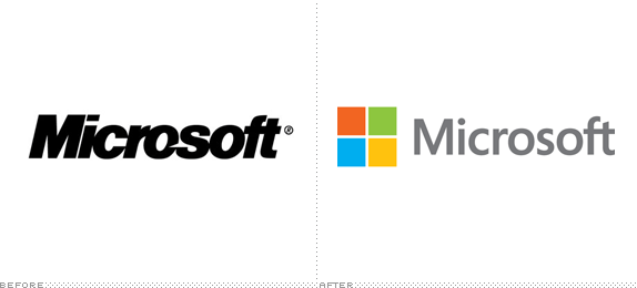
Microsoft unveiled their updated logo just 3 days ago and it is making quite a stir. Always known to be the neccessary evil in the computer industry, Microsoft has been making some powerful strides within the past two launches that are making people rethink the company again. According to Under Construction, “…Microsoft made its biggest move yesterday, with the introduction of the new logo, to transform its identity and its perception among consumers. The new logo was designed internally but is reflective of the involvement of outside consultancies that have been helping Microsoft reshape many of its brand touchpoints.”
Take a look at the progressive changes Microsoft has been making
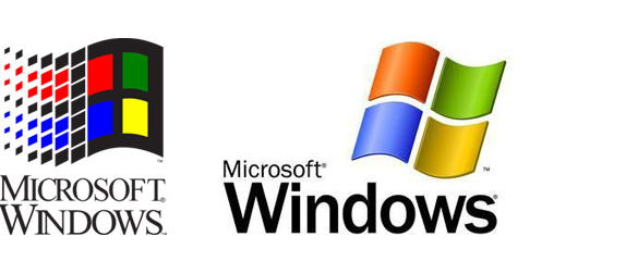
Older logos from way back when…
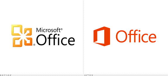
And now we take a look at Microsoft Office. Quite a turnaround…
August 27, 2012 | No Comments


